Event 01.
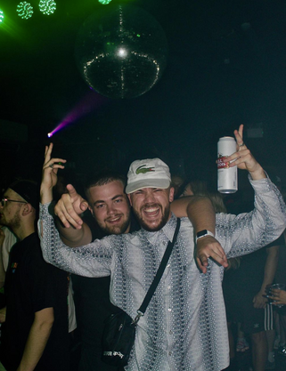
Debut event
The Crofter Rights 2019

Breach events is an events company run by myself and a few others. Myself and another designer on the course are on the design team and come up with all the designs used throughout the whole brand.
We decided from the start that the look and theme should be simple and be limited to around 3 colours. We chose to use the base colours of green and black. We felt that this would give our brand a unique feel as when we did research there was nobody else in this specific corner of the events management business using design and imagery in this way.
This has been a great success in our time as a collective and we feel from feedback and criticism that this colour theme is unique to us and gives us a strong brand identity. We plan to carry this on throughout which will only increase the strength of the brand and make us different from the rest.
This is the first line-up poster that we designed for our first event back in October of 2019. We tried to create a three dimensional illusion with the surroundings of the type. This was intended to look like the type was bursting through the page which gave our design a wow factor and more of a bold approach.
This has had a positive impact on me as a designer as I have not only been collaborating with another designer but have also been learning about how businesses run and how my designs can impact the success of it all.

Event 02.
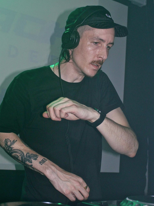
Second event
The Crofter Rights 2020


For our second event we collaborated with a Cinema 4D professional based in London to create the branding for the next installment of events.
We decided from the start that the look and theme should be simple and be limited to around 3 colours. We chose to use the base colours of green and black. We felt that this would give our brand a unique feel as when we did research there was nobody else in this specific corner of the events management business using design and imagery in this way.
This has been a great success in our time as a collective and we feel from feedback and criticism that this colour theme is unique to us and gives us a strong brand identity. We plan to carry this on throughout which will only increase the strength of the brand and make us different from the rest.
This is the first line-up poster that we designed for our first event back in October of 2019. We tried to create a three dimensional illusion with the surroundings of the type. This was intended to look like the type was bursting through the page which gave our design a wow factor and more of a bold approach.
This has had a positive impact on me as a designer as I have not only been collaborating with another designer but have also been learning about how businesses run and how my designs can impact the success of it all.


